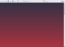
There should be some text and
images and shit but all we get is
this vile coloured emptiness

Because some stupid fucking
cunt has made it do that on purpose.
Not restaurant ones, computer ones. To be more specific, shit computer ones off the internet. And most especially, FUCKING STUPID shit computer ones off the internet that not only don't work but stop everything else working too because they were implemented by a bunch of GIGANTIC FLAMING FUCKING IDIOTS.


To take just one example: today I followed a link posted by someone who didn't understand some bit of British popular culture (turned out I didn't either, but that's by the by). The destination website, however, turned out to be unreadable. Instead of seeing some text and images and shit like I was expecting to, all I got was a blank screen in a lysergically disgusting colour, as shown on the right.
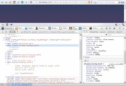
Inspecting the page with the browser's debugger revealed the reason: some mindless dribbling fucking cunt has deliberately created a DIV that sits immovably on top of everything else and fills the entire fucking screen. It looks like it's supposed to be a menu, but there's fuck all actually in it, and in any case content or no content there is no fucking excuse for making the sodding thing blank out the entire fucking screen so you can't fucking read the fucking website.
Simply deleting the node solved the problem and made the website readable. It then turned out that it hadn't been worth reading anyway (all fucking videos, no transcripts, fucksake I want TEXT not this video shite), but that's not the point of this rant.
But what's really fucking annoying is it isn't just this one crappy website. This sort of stupid fucking shit happens all the fucking time these days. As can be seen from the debugger screenshot, the site concerned is a Wordpress site. It's almost universal for Wordpress sites to do this kind of stupid shite these days: Wordpress is fucking useless because sites made with it do not fucking work. Never mind the constant flow of vulnerabilities; they just make it a bad idea, but having stuff deliberately included in it that makes sites not fucking work makes it a fucking useless idea. And there is such an arse-stretchingly immense shitpile of fucking stupid things that make sites not work in it that it's very hard to write a single universal client-side Wordpress-fixing script to take out all the different kinds of stupid.
Nor is it by any means limited to Wordpress. Mindbuggeringly moronic menus masking the content, and other equally stupid shit that has the same effect, are so fucking common these days you'd think that people were actually asking for websites that won't let you cunting read anything. I'm sick to the bloody bollocks of having to open up the debugger and delete stupid nodes that are deliberately set up to hide the content before I can fucking read anything. And I'm sick to the bloody bollocks of having to write yetableedingnother client-side script or CSS fragment to get rid of the stupid fucking things automatically if I want to read more than a couple of different pages on the site.
Shitting penises, for fuck's sake. LOOK. THIS is how you do a fucking menu: (No, none of it does anything, it's just for show...)
Notice the following IMPORTANT SHIT:
Fucksake if you can't work it out for yourself feel free to copy the source code of this page. Note that the spaces at the beginning and end of the content of the LI elements are required, because if you don't have them then you do get spaces appearing in the menu and fucking it up. If you do put spaces in, you don't get spaces coming out. There are a shitload of clever tricks to try and stop this happening but none of them fucking work, and of the blunt-instrument approaches this is the least horrible and the only one that actually makes the code more readable than not using it. The CSS all scales off the font size, so start by setting the font size on the .menu class and then work down fucking about with margins and backgrounds and shit as appropriate.
Back to Crap Stuff
Back to Pigeon's Nest
Be kind to pigeons