Verdana - scourge of the internet. It looks like a piece of shit, which isn't surprising, since apparently Microsoft were responsible for originating it. Here is an image of it:
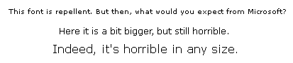
Look at the lower-case "m" in that first line. It looks like two "n"s squashed up to each other... the sort of thing kids do when they're learning to write. In fact if you magnify the image up you can see that's exactly what it is. And the larger sizes look like the fonts used in "Peter and Jane" learning-to-read books. What we have, in fact, is professional font designers promulgating for widespread adult use something which is straight out of the kindergarten.
The excuse given is that it's supposed to be "easy to read". What a load of bollocks. There are already loads of fonts around which are perfectly easy to read and don't look so fucking ugly. Helvetica, for one. There's even a Microsoft version of Helvetica - Arial - which is perfectly easy to read and looks reasonably decent. So what the fuck is the real point of Verdana? I reckon it's part of the whole Microsoft conspiracy to force everyone using a computer back down to the kindergarten level of mental function where they have to get someone else to do everything for them and watch over everything they do. Like the way the Windoze GUI looks more and more Fisher-Price with every new version. It's a psychological softening-up process. Use a kindergarten font and you make people think at a kindergarten level and compliantly accept everything teacher tells them. Well, fuck that. I use Linux, and Bill Gates can kiss my arse. When I've got uncontrollable diarrhoea.
What makes it worse is that even people with no connection with Microsoft are plugging it. Web pages all over the place are written in this fucking ugly shit. It's a pain in the arse. Why do people insist on using it? I keep seeing over-prescriptive font specifications - CSS documents with "font-family: Verdana, Arial, Helvetica, sans-serif"... NO!!! Just say "sans-serif" and let the USER decide what font to tell their browser to use for sans-serif.
Yes, with some browsers it is possible to set user CSS documents configured to override the CSS of any given site. But it's an arseache doing it every time you go to another site and find it insisting on using this repellent excuse for a font. There doesn't seem to be any way of telling the browser "never ever use Verdana no matter what any bloody site says". So I resorted to a brute-force solution:
# for x in `find / -name '*erdana*.ttf'`; do rm $x; done; dpkg-reconfigure fontconfig
Since then I have discovered the rewriting proxy middleman, which allows me to write regexes to strip out "Verdana" from the font specifications. However, the brute-force solution is still simpler.
It has occurred to me that if you're reading this on a Microshite system, it might default to Verdana for "sans-serif" anyway, so my "example" image looks the same as the rest of the text. If this is the case, you have my sympathy.
Here is a sample of the feedback to this rant.