How the fuck are you supposed to read this?

CSS written by a wanker
Listen you cunts: get this through your neutronium skulls. MENU BARS ARE NOT SUPPOSED TO PREVENT YOU READING THE FUCKING PAGE.
Menu bars are supposed to be statically positioned at the top of the page, and to scroll up and down along with all the rest of the content, so when you scroll down they go off the top of the screen just like all the other things do.
Menu bars are NOT supposed to be stationarily positioned ON the top of the rest of the fucking page so you can't flaming well read the fucking content.
Got that? "STATICALLY positioned AT the top" is NOT the same as "stationarily positioned on top". Which really ought to be flaming bloody obvious because the result of getting it wrong is so blatantly shit and useless, but such inability to perceive the blatantly obvious is sadly nothing other than simply what you expect from the intellectual microcalibre of the kind of fucking morons who put web sites together.
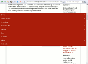
Look at the example on the right. You get four fucking lines of the article text, then this bloody great red thing wipes out most of the page and below that the article is blanked. So nearly all the screen is displaying nothing useful and you have to read the article through this tiny little letterbox right at the top. What the absolute fuck is the point of making something that is so fucked up and useless and shit?
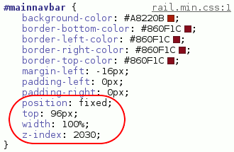
Underneath we can see why it's doing it, at least in the technical sense. The CSS rule for that element specifies position: fixed;, which means "do not scroll up and down with the rest of the page". It ought to be position: static;, which means "static relative to the rest of the page", so as the page scrolls up and down the element scrolls along with it (and which is the default, so wouldn't actually need to be explicitly specified).
You might think that the dumb twats have just got the two mixed up, although that still doesn't explain why they don't twig on when they look at the result. But in fact they have done it on purpose, as we can see from the rules width: 100%; and z-index: 2030;, which can only be there as the result of a deliberate intention to make the fucking thing sit on top and get in the way so you can't fucking read the page.
And the trouble is the bastard thing WON'T FUCK OFF. As soon as the stylesheet rail.min.css is loaded, there it is. And there you are, fucked, because the only way to get rid of it is to open the debugger and delete the offending code. Nothing else will flaming shift it. Which really is a fucking outrageous load of fucking shite.
Do the fucking twats somehow think it will disappear of its own accord, or something? Because it FUCKING DOESN'T. Why should it? Its default condition is defined to be on top of everything fucking it all up, and fuck it all up is exactly what it does do until that definition is deleted. Which of course I have to do myself.
So, I open the debugger. I delete the fucking thing. And then what do I find...? Is the page now readable...? No!! There's a second fucking layer of arse right underneath it!!!
For fuck's sake! What is this shite? First they fuck up the page by hiding most of it under "Special Reports" and "Rail Review", then they double-fuck it by hiding that under the stupid great huge fixed fucking menu bar. What the fuck is the point of putting the "Rail Review" bit there in the first place? What the bastarding cuntdrips are they fucking playing at?
There is a principle, variously stated, to the effect that should you ever be tempted to think "Naah... no cunt could possibly ever be stupid enough to do that", you are sure to be proved wrong. The kind of mindless morons that we find putting websites together demonstrate its truth beyond all doubt.
As with the menu bar, the "Rail Review" thing is defined to be a fuckup as part of the stylesheet. As with the menu bar, from the moment the stylesheet is loaded, the bloody thing is there, and there it stays no matter what you do. As with the menu bar, its default condition is to fuck things up, and fuck things up is what it does.
And as with the menu bar, the only way to get rid of it is to use the debugger to delete the offending code. Which is a fucking appalling way to have to use a web page, and a far inferior option to compelling the stupid bastards who inserted the stuff that needs deleting to fucking delete it off the server, and then eat their own shit.
And so FINALLY, after deleting two superimposed instances of mindless bleeding stupidity, I can finally get to read the fucking article which I fucking went there for in the first place.
Only now I am pissed off.
And I still have to add yet another item to my already depressingly huge collection of scripts for automatically unfucking websites that have been put together by dedicated competitors for the title of Stupidest Cunt In The World who can't even see how utterly fucking useless a piece of shit they have produced, because otherwise when I go to the next page of the article I'll have to unfuck it by hand all over again.
Using the internet would be SO much easier if the place wasn't so stuffed full of all these stupid bastards deliberately making websites as ridiculously and idiotically unusable as they possibly can.
So why don't the whole flaming shower of you fucking idiots just fuck right off and leave the assembling of websites to people who are actually capable of seeing that if you can't fucking read the site then it is shit.
Back to Webshite
Back to Pigeon's Nest
Be kind to pigeons