
I'm not blind yet, you cunts
What the fuck is it these days with websites presenting their text - even quite long articles - in a stupidly bloody gigantic font so there's only room for a few words on the screen at once?
Look at this crap. (It's scaled down by half; click the picture to get the full size version and see the effect in all its true horror. Or perhaps the horror is just as well conveyed by the observation that even though it is scaled down by half, that has not shrunk the page text beyond legibility like it has the URL bar?)
Apparently some flaming dickhead has taken it as a design requirement that the text is still legible even if you're standing on the other side of the room. Well surprise surprise, I don't want to fucking do that at all. What I do want to do is to get a decent amount of text on the screen at a time, so I can read through it sensibly without having to fucking scroll and scroll all the time like a cunt just to read one fucking sentence. (And how am I supposed to reach the keyboard to scroll with if I'm standing on the other side of the room anyway?)
(Also, of course, they need to take note of my position: fixed page, and also Font Arsehole, which I haven't written yet. But those aren't what this page is about.)

Basically, it's taking the place of a book. So it ought to behave like one. Unfortunately instead of behaving like the textbook type of book which it is taking the place of, it has decided to behave like "Peter and Jane learn RF stuff", and this is shit.
In fact it's more than shit, it's counterproductively shit. Huge text with only a few words on a page may make things easier when you're so new to reading that you're still working in units of letters rather than whole words, but I think it's a fairly safe assumption that if you're reading an article about transmission line impedance matching you started working in units of whole words quite a long time ago. Me, I'm doing something like working in units of strings of several words together, so this stupid giant font shit means there are only one or two such units on the screen at a time, which is fucking hopeless. Effectively I'm being forced to extract technical information from input which is restricted all the way back down to the "A is for Arsehole" level, when the point of a piece of the information may extend over a paragraph or two at a time.
Indeed we know this is shit, because we've had a physical demonstration of it with those crappy "memory typewriter" things that were around for a few years and then vanished like smoke. They had a one-line input buffer and the idea was that you could type into that buffer and then use the built-in 40-character LCD display to correct any errors before you hit return, whereupon it would print the line out. I don't think they were even particularly expensive. But nobody wanted one because checking over the text a titchy bit of it at a time was a fucking hopeless way of doing it. It was easier just to find the mistakes on the actual paper and correct them with tippex or a typewriter with a correction ribbon.
And because having a shitty little screen that only shows a few words at a time is fucking hopeless, we develop great big screens for computers that can show several hundred words at a time, and it makes things so enormously much easier that no fucker in their right mind would want to go back to 40 characters on a yellow-background LCD.
Only, as previously noted many times, the oxygen-stealing fungoid slime-creatures that somehow get called "web developers" don't have any kind of mind to be in at all. So what do the irretrievable fuckwads do but make the bloody letters so fucking huge that there's only room for a few of them even on a great big screen, so we might just as fucking well be still stuck with 40 characters on a yellow-background LCD. All the advantage gained from all those years of screen development negated at a stroke by a stupid cunt.

FOR FUCK'S SAKE PACK IT IN YOU STUPID FUCKING WANKERS.
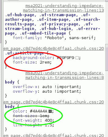
What makes this instance particularly galling is that they actually started off getting it right, but then they went and fucked it up on purpose. Look at the CSS inheritance on the right. The declaration for the body element sets a sensible font size. But then they override this with another declaration in the same fucking file so all the actual content is ridiculously large, for no fucking reason at all.
If the stupid fuckers had simply not bothered to put that second declaration in, it would have come out just fine. As we can see quite clearly from the screenshot of the result of disabling the shitty declaration. Now the text is a sensible size and you can fit plenty of it on the screen at the same time, and the only huge bits are the headings (which you can now clearly see are headings, whereas before they looked nearly the same as the rest of it).
For fuck's sake. These cunts who spew out websites really are fucking beyond hope.
Back to Webshite
Back to Pigeon's Nest
Be kind to pigeons
![]()